Replace. needed a corporate website as precise as the brand behind it: services easy to grasp, craft visible, contact reachable. We built information architecture, UI, and frontend as one system — Inter, Picton blue, and an inquiry path that stays readable on every page.
Starting point
Before the relaunch, digital presence felt fragmented: brand and site were not on one line, the path to inquiry was not clear enough, and the offer read as interchangeable. The goal was a surface that earns trust before the first conversation.
Strong brand · site not yet aligned
Goals and success criteria
Visitors understand in under a minute what Replace. does and for whom.
Every service page leads naturally to contact — no CTA maze.
UI and brand tokens (Inter, Picton blue, light theme) stay consistent and maintainable.
Process
Orientation & IA
Mapped offers, audiences, and conversion path. Condensed the site map to short English slugs and a clear hierarchy.
Without structure, even strong design feels arbitrary — path first, then surface.
UI & design system
Carried components, type scale, and color from the brand identity onto the site. Soft bento, one primary CTA per view.
The site is the brand’s digital surface — tokens must live in the UI, not only in a PDF.
Build & launch
Next.js App Router, localized DE/EN, performance and a11y from the start. Contact as the clear endpoint.
Craft does not end in Figma — the site has to be fast, readable, and maintainable.
Design decisions
One conversion path with earned intermediate steps
Problem
Too many entry points and competing CTAs dilute the path to inquiry.
Options
Hard sell on every section vs. earned intermediate steps (service → detail → contact).
Decision
One conversion path with earned intermediate steps
Why
Not every page needs a hard sell. Orient, deepen, then contact — it feels earned and keeps hierarchy calm.
Hero with one clear next action
Soft bento instead of card spam
Problem
Agency sites slide easily into badge clutter and generic feature grids.
Options
Dashboard-style with stats and pills vs. open bento with craft focus.
Decision
Soft bento instead of card spam
Why
Cards only when they carry interaction. Otherwise spacing, type, and real imagery — soul through craft, not chrome.
One token system for brand and site
Problem
Brand and UI risked becoming two systems — guidelines here, site there.
Options
Separate web theme vs. brand tokens 1:1 in globals/@theme.
Decision
One token system for brand and site
Why
Picton blue, Inter, and the light theme live in one system. The site does not re-decide what the brand already solved.
Color system as UI tokens
Design system excerpt
Color
Malibu#7CC6FEPrimary · accent & signal
Mirage#101828Text · headlines
Zircon#EBF0F9Surface · calm backgrounds
AaMirage on Zircon
15.5:1AAA
AaMirage on Malibu
9.6:1AAA
Typography
Corporate website with a clear user flow
Inter Display40040–64 pxHero & section titles
A site that connects offer, team, and contact in one calm path — no agency theater.
Inter Body30018 pxBody & support copy
Components
ContactIdle
ContactHover
ContactFocus
Primary button
Idle · hover (slight lift) · visible focus ring
EmailIdle
EmailClick
Emailada@replaceweb.deFocus
Text field
Empty · click opens the field · focus with floating label
Grid
4pt grid, generous section spacing, ~65ch measure. Soft bento for services and portfolio — no even three-up feature cards.
Implementation
Built with Next.js App Router, TypeScript, and Tailwind v4. Locales via /de and /en, short English slugs. Server Components by default — client only where interactivity is real.
CMS concept
Content close to code (dictionaries & content modules) — fast to iterate without CMS overhead for a small team.
Client edits
Copy and cases via content modules; images under public/ — clearly separated from layout components.
Notes
Proxy instead of middleware (Next 16), design tokens in globals.css, motion limited to transform/opacity with prefers-reduced-motion.
Visual strip
Desktop
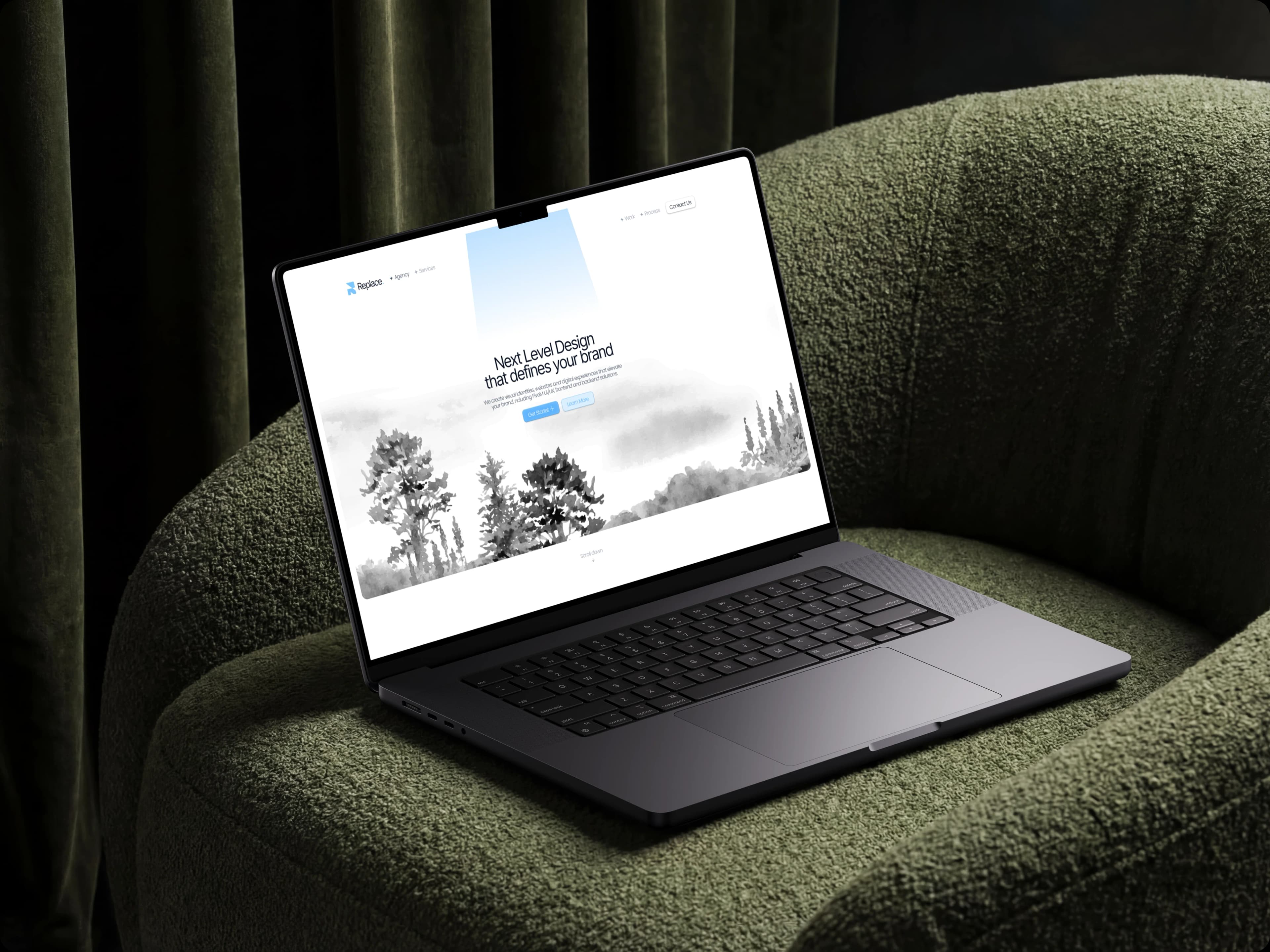
Desktop — landing with brand and clear offer
Desktop — wordmark and signal period in layout
Results
Orientation
Before
Offers and entry points felt scattered
After
Three clear offers, one readable path
Period
Launch 2025
Method
IA review & content walkthrough as a team
Brand ↔ site
Before
Guidelines and UI pulled apart
After
One token system for brand and website
Period
Design-system phase
Method
Token sync brand guidelines ↔ globals.css
Blog and case studies keep growing — the structure is in place, content is sharpened ongoing.
Client voice
The site should feel like how we work: clear, honest, no theater. If after scrolling you know what we do and how to reach us — it lands.
We use technically necessary storage and — only with your consent — Google Analytics so we can improve the site. Details are in the privacy policy. Privacy