A website that speaks equally to science and business
A site that carries Shiraz, wordmark, and type from the brand identity 1:1 — clear in the offer, calm in impact.
Services
UX/UI, corporate website, design system
Duration
2025 · 6 weeks
Role
Design & build (end-to-end)
Stack
Next.js · TypeScript · Tailwind
Status
Design & prototype
Industry
Communication consulting · science & business
After — website aligned with the brand identity
Summary
k2.komm advises at the intersection of science and business. The brand was set — wordmark, Shiraz, and Avenir Next were defined. The website had to carry that precision digitally: readability for two audiences, trust in the first second, an inquiry path without agency theater.
Starting point
Brand guidelines, wordmark, and print touchpoints were in place — digital presence did not yet match the identity. Audiences from science and business need different entry points but the same trust signal. The site had to connect both without becoming two brands.
Strong identity · website not yet aligned
Goals and success criteria
Visitors from science and business understand the offer in under a minute.
Shiraz, Blue Bayoux, and type from the guidelines sit 1:1 in the UI — no separate web theme.
Every page leads naturally to contact — no competing CTAs.
Process
Brand → UI mapping
Carried color system, type scale, and wordmark from guidelines onto screen sizes and breakpoints. Mapped hierarchy for two audiences.
The brand was precisely defined — the site must not re-invent what guidelines already solved.
Structure & key screens
Information architecture for consulting offer, team, and references. Key screens with Avenir Next and Montserrat — calm surfaces, Shiraz as signal.
Communication consulting runs on trust — structure must feel confident before anyone scrolls.
Build & touchpoints
Responsive frontend, browser and social mockups as digital brand surfaces. Performance and readability from the start.
k2.komm is visible in the network — website, social, and browser chrome must read as one line.
Design decisions
One site, two reading paths
Problem
Two audiences — science and business — risk parallel entry points and diluted hierarchy.
Options
Separate landing pages vs. one site with clear paths and a shared wordmark.
Decision
One site, two reading paths
Why
Shiraz and the wordmark connect both worlds in the first second. Different entry points, one system — no split into two brands.
Hero with wordmark and clear audience orientation
Guidelines become UI tokens
Problem
Brand guidelines and UI risked becoming two systems — PDF here, Figma there.
Options
Separate web theme vs. brand tokens 1:1 in globals/@theme.
Decision
Guidelines become UI tokens
Why
Shiraz, Blue Bayoux, and Black Haze live as CSS tokens. Avenir Next and Montserrat sit in the type scale — the site does not re-decide.
Wordmark and grid as the UI starting point
Type and color instead of card spam
Problem
Consulting sites slide easily into generic feature grids and stock-photo aesthetics.
Options
Dashboard-style with stats vs. calm surfaces with real brand presence.
Decision
Type and color instead of card spam
Why
k2.komm runs on precision — generous spacing, clear headlines, Shiraz as accent. No badge clutter, no three equal feature cards.
k2.komm
Communication is the simplest tool we have, and the hardest to use well.
Digital surface — browser, social, and the Shiraz follow button
Design system excerpt
Color
Shiraz#AA0E37Primary · accent & signal
Blue Bayoux#4D5C61Text · calm & hierarchy
Black Haze#F5F7F7Surface · light backgrounds
AaBlue Bayoux on Black Haze
6.5:1AA
AaWhite on Shiraz
7.4:1AAA
Typography
A website that speaks equally to science and business
Avenir Next60036–56 pxHeadlines & section titles
A site that carries Shiraz, wordmark, and type from the brand identity 1:1 — clear in the offer, calm in impact.
Montserrat40017 pxBody copy, labels & navigation
Components
InquiryIdle
InquiryHover
InquiryFocus
Primary button
Idle · hover (Shiraz deepens) · visible focus ring
ConsultingSee moreIdle
ConsultingSee moreHover
ConsultingSee moreFocus
Service block
Rest · hover with clear forward path
Grid
4pt grid, generous section spacing, ~70ch measure. Calm surfaces with Shiraz accents — no even feature-card grids.
Implementation
Built with Next.js App Router, TypeScript, and Tailwind v4. Brand tokens from guidelines directly in globals.css — Shiraz, Blue Bayoux, Avenir Next, and Montserrat as CSS variables.
CMS concept
Content close to code — fast to iterate for a small consulting team, without CMS overhead.
Client edits
Copy and references via content modules; images under public/ — separated from layout components.
Notes
Server Components by default, motion limited to transform/opacity with prefers-reduced-motion. Social and browser mockups delivered as digital brand surfaces.
Visual strip
Before / after
Before — strong identity, digital surface still fragmented
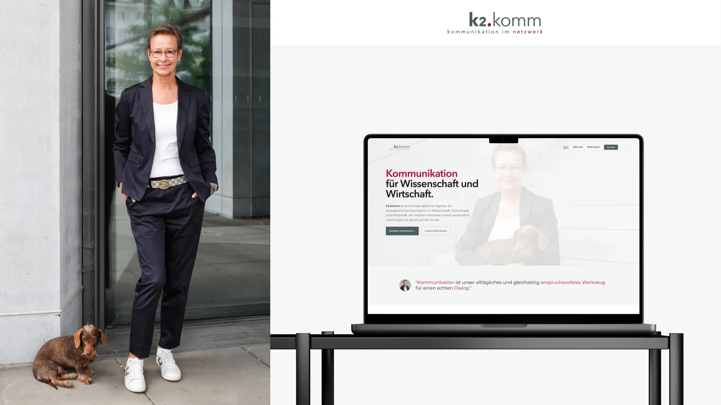
After — website aligned with the brand identity
Desktop
Desktop — landing with wordmark and consulting offer
k2.komm
Desktop — full brand browser chrome
Mobile
Communication is the simplest tool we have, and the hardest to use well.
Mobile — social profile, avatar, and follow button
Details
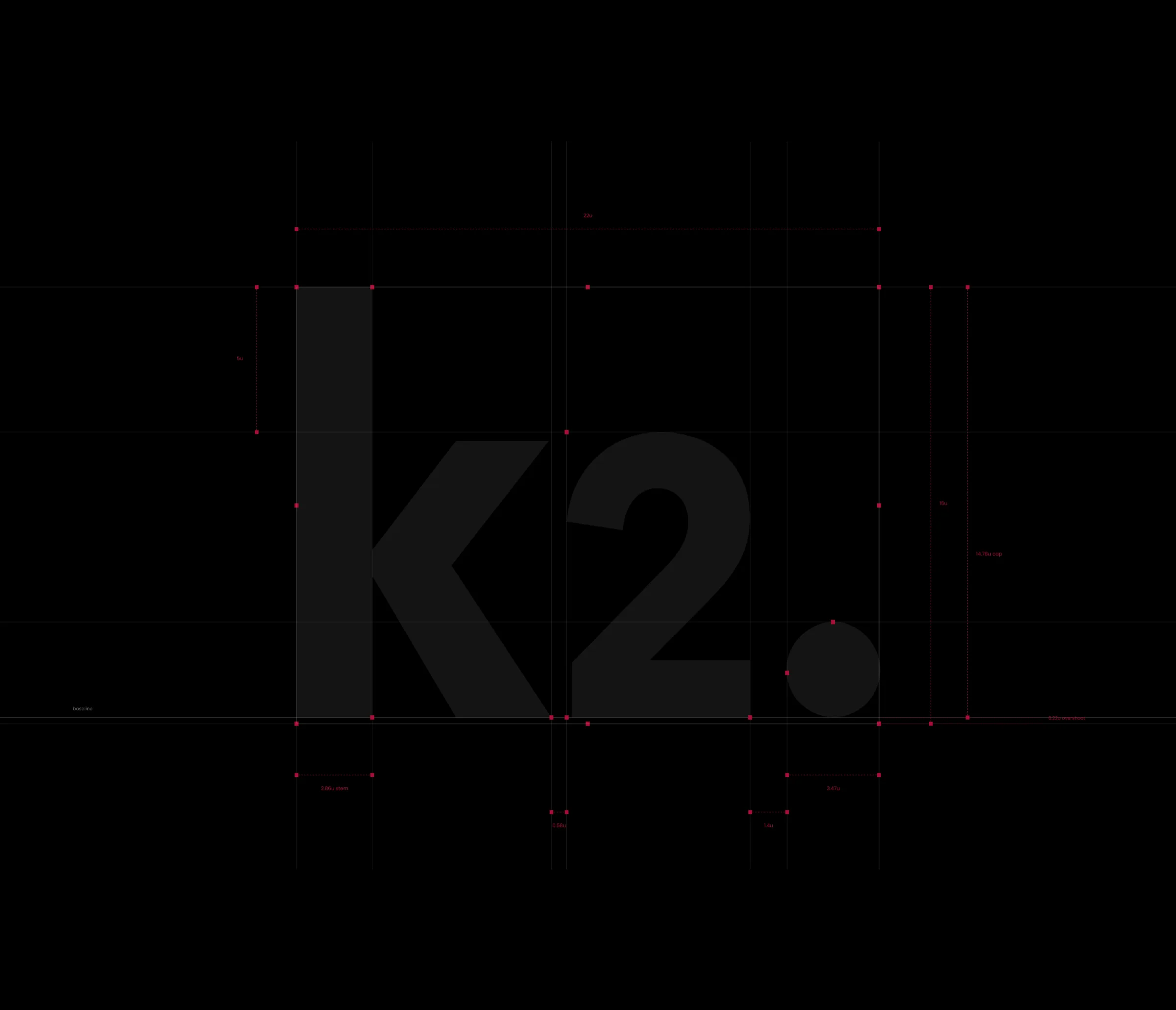
Detail — wordmark and construction grid
Detail — print and digital on one line
Results
Brand ↔ site
Before
Guidelines and UI pulled apart
After
One token system from wordmark to browser chrome
Period
Design-system phase
Method
Token sync brand guidelines ↔ UI kit
Audiences
Before
Science and business without a clear digital path
After
Two reading paths, one wordmark, one inquiry endpoint
Period
IA & launch
Method
Content walkthrough & audience review
Reference cases and blog grow with the mandate — structure and design system are ready.
Client voice
When someone from science and someone from business land on the same page and both instantly know what k2.komm stands for — we hit the right balance.
We use technically necessary storage and — only with your consent — Google Analytics so we can improve the site. Details are in the privacy policy. Privacy
A website that speaks equally to science and business
A site that carries Shiraz, wordmark, and type from the brand identity 1:1 — clear in the offer, calm in impact.
Services
UX/UI, corporate website, design system
Duration
2025 · 6 weeks
Role
Design & build (end-to-end)
Stack
Next.js · TypeScript · Tailwind
Status
Design & prototype
Industry
Communication consulting · science & business
After — website aligned with the brand identity
Summary
k2.komm advises at the intersection of science and business. The brand was set — wordmark, Shiraz, and Avenir Next were defined. The website had to carry that precision digitally: readability for two audiences, trust in the first second, an inquiry path without agency theater.
Starting point
Brand guidelines, wordmark, and print touchpoints were in place — digital presence did not yet match the identity. Audiences from science and business need different entry points but the same trust signal. The site had to connect both without becoming two brands.
Strong identity · website not yet aligned
Goals and success criteria
Visitors from science and business understand the offer in under a minute.
Shiraz, Blue Bayoux, and type from the guidelines sit 1:1 in the UI — no separate web theme.
Every page leads naturally to contact — no competing CTAs.
Process
Brand → UI mapping
Carried color system, type scale, and wordmark from guidelines onto screen sizes and breakpoints. Mapped hierarchy for two audiences.
The brand was precisely defined — the site must not re-invent what guidelines already solved.
Structure & key screens
Information architecture for consulting offer, team, and references. Key screens with Avenir Next and Montserrat — calm surfaces, Shiraz as signal.
Communication consulting runs on trust — structure must feel confident before anyone scrolls.
Build & touchpoints
Responsive frontend, browser and social mockups as digital brand surfaces. Performance and readability from the start.
k2.komm is visible in the network — website, social, and browser chrome must read as one line.
Design decisions
One site, two reading paths
Problem
Two audiences — science and business — risk parallel entry points and diluted hierarchy.
Options
Separate landing pages vs. one site with clear paths and a shared wordmark.
Decision
One site, two reading paths
Why
Shiraz and the wordmark connect both worlds in the first second. Different entry points, one system — no split into two brands.
Hero with wordmark and clear audience orientation
Guidelines become UI tokens
Problem
Brand guidelines and UI risked becoming two systems — PDF here, Figma there.
Options
Separate web theme vs. brand tokens 1:1 in globals/@theme.
Decision
Guidelines become UI tokens
Why
Shiraz, Blue Bayoux, and Black Haze live as CSS tokens. Avenir Next and Montserrat sit in the type scale — the site does not re-decide.
Wordmark and grid as the UI starting point
Type and color instead of card spam
Problem
Consulting sites slide easily into generic feature grids and stock-photo aesthetics.
Options
Dashboard-style with stats vs. calm surfaces with real brand presence.
Decision
Type and color instead of card spam
Why
k2.komm runs on precision — generous spacing, clear headlines, Shiraz as accent. No badge clutter, no three equal feature cards.
k2.komm
Communication is the simplest tool we have, and the hardest to use well.
Digital surface — browser, social, and the Shiraz follow button
Design system excerpt
Color
Shiraz#AA0E37Primary · accent & signal
Blue Bayoux#4D5C61Text · calm & hierarchy
Black Haze#F5F7F7Surface · light backgrounds
AaBlue Bayoux on Black Haze
6.5:1AA
AaWhite on Shiraz
7.4:1AAA
Typography
A website that speaks equally to science and business
Avenir Next60036–56 pxHeadlines & section titles
A site that carries Shiraz, wordmark, and type from the brand identity 1:1 — clear in the offer, calm in impact.
Montserrat40017 pxBody copy, labels & navigation
Components
InquiryIdle
InquiryHover
InquiryFocus
Primary button
Idle · hover (Shiraz deepens) · visible focus ring
ConsultingSee moreIdle
ConsultingSee moreHover
ConsultingSee moreFocus
Service block
Rest · hover with clear forward path
Grid
4pt grid, generous section spacing, ~70ch measure. Calm surfaces with Shiraz accents — no even feature-card grids.
Implementation
Built with Next.js App Router, TypeScript, and Tailwind v4. Brand tokens from guidelines directly in globals.css — Shiraz, Blue Bayoux, Avenir Next, and Montserrat as CSS variables.
CMS concept
Content close to code — fast to iterate for a small consulting team, without CMS overhead.
Client edits
Copy and references via content modules; images under public/ — separated from layout components.
Notes
Server Components by default, motion limited to transform/opacity with prefers-reduced-motion. Social and browser mockups delivered as digital brand surfaces.
Visual strip
Before / after
Before — strong identity, digital surface still fragmented
After — website aligned with the brand identity
Desktop
Desktop — landing with wordmark and consulting offer
k2.komm
Desktop — full brand browser chrome
Mobile
Communication is the simplest tool we have, and the hardest to use well.
Mobile — social profile, avatar, and follow button
Details
Detail — wordmark and construction grid
Detail — print and digital on one line
Results
Brand ↔ site
Before
Guidelines and UI pulled apart
After
One token system from wordmark to browser chrome
Period
Design-system phase
Method
Token sync brand guidelines ↔ UI kit
Audiences
Before
Science and business without a clear digital path
After
Two reading paths, one wordmark, one inquiry endpoint
Period
IA & launch
Method
Content walkthrough & audience review
Reference cases and blog grow with the mandate — structure and design system are ready.
Client voice
When someone from science and someone from business land on the same page and both instantly know what k2.komm stands for — we hit the right balance.
We use technically necessary storage and — only with your consent — Google Analytics so we can improve the site. Details are in the privacy policy. Privacy